Artisan Pehchaan Card
Making the application easier to understand, one field at a time.
- Designer
- Kuldeep Singh
- Focus
- Usability & information hierarchy
- Output
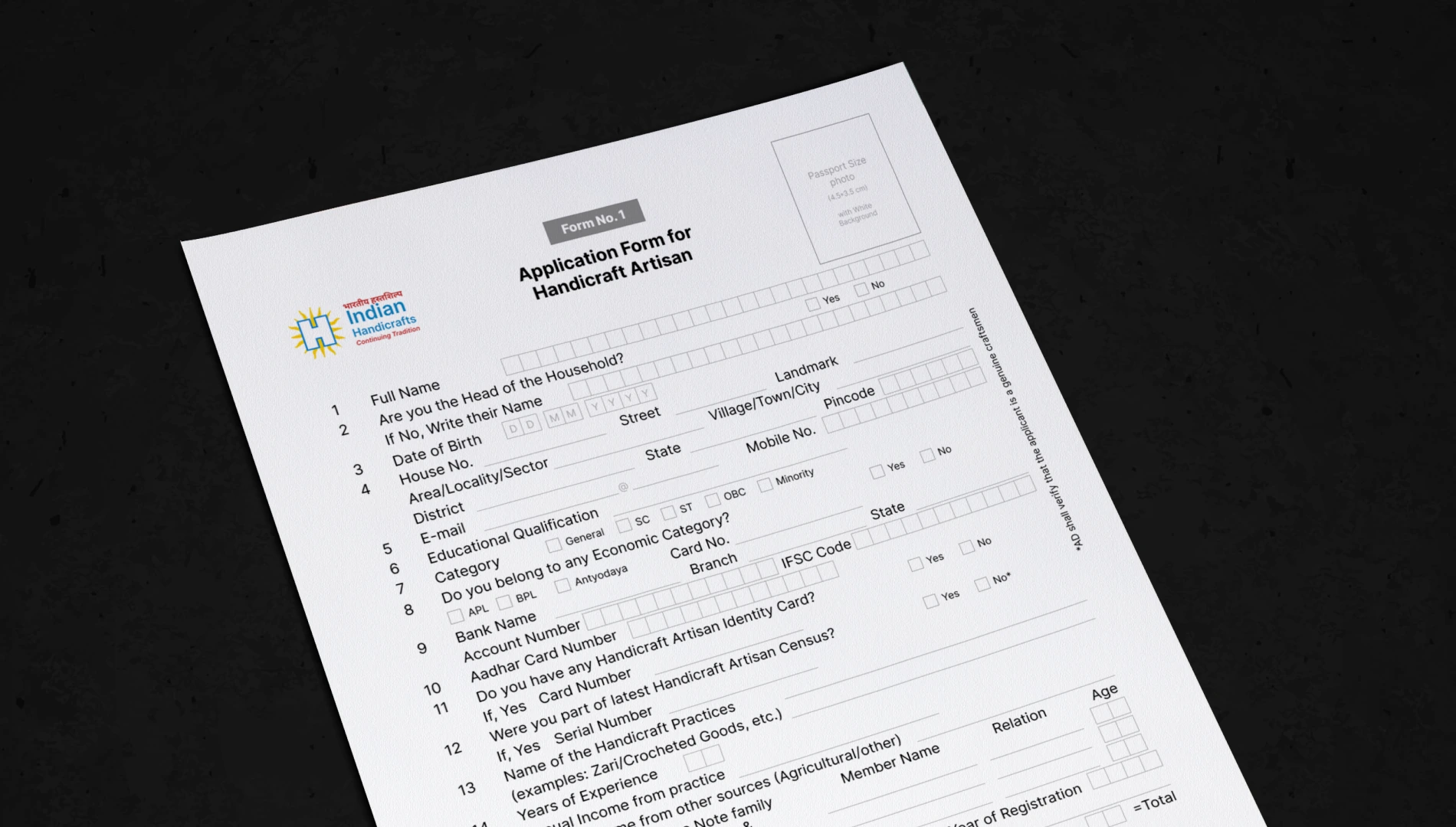
- Redesigned paper application
Context
A small form. An important point of access.
The Pehchaan application registers handicraft artisans for formal recognition and access to government support. It collects personal, professional and financial information, often with help from NGOs or local facilitators.
Manual verification, unclear documentation requirements and limited digital access add friction. This project focuses on the paper form itself: making it clearer for applicants and the people helping them.
Usability audit
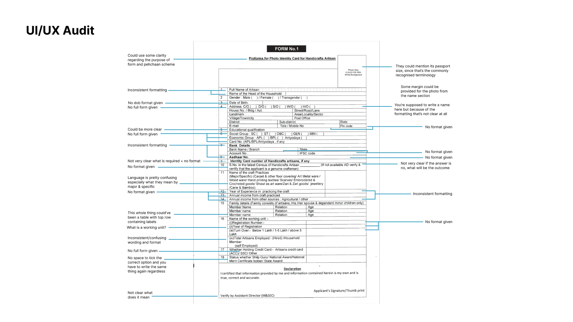
The applicant should not have to decode the form.
I reviewed the form field by field, looking at language, input formats, grouping and the space available to respond. Instructions left out familiar terms such as passport-size photograph. Dates, phone numbers and account details gave little guidance on how to answer, and abbreviations like “working unit” put interpretation on the applicant.
Questions about existing cards did not clearly separate yes, no and the follow-up needed. Family details had no clear table header, and dense, uneven formatting made everything look equally important.
Information structure
I found the structure before changing the layout.
Mapping the existing fields revealed seven groups of information. That separated personal answers, verifiable records and official declarations, and gave each a clearer place on the page. A consistent column and baseline grid then aligned labels, writing lines and character boxes, so spacing and hierarchy do the organising without adding more instructions.
- Personal detailsName, household and date of birth
- Address & contactLocation, email and mobile number
- Verifiable recordsCategory, bank details and identification
- Handicraft detailsCraft practice, experience and income
- Family detailsMember name, relationship and age
- Working unitRegistration, turnover and employment
- DeclarationApplicant confirmation and official verification
The redesign
Clearer questions. More predictable answers.
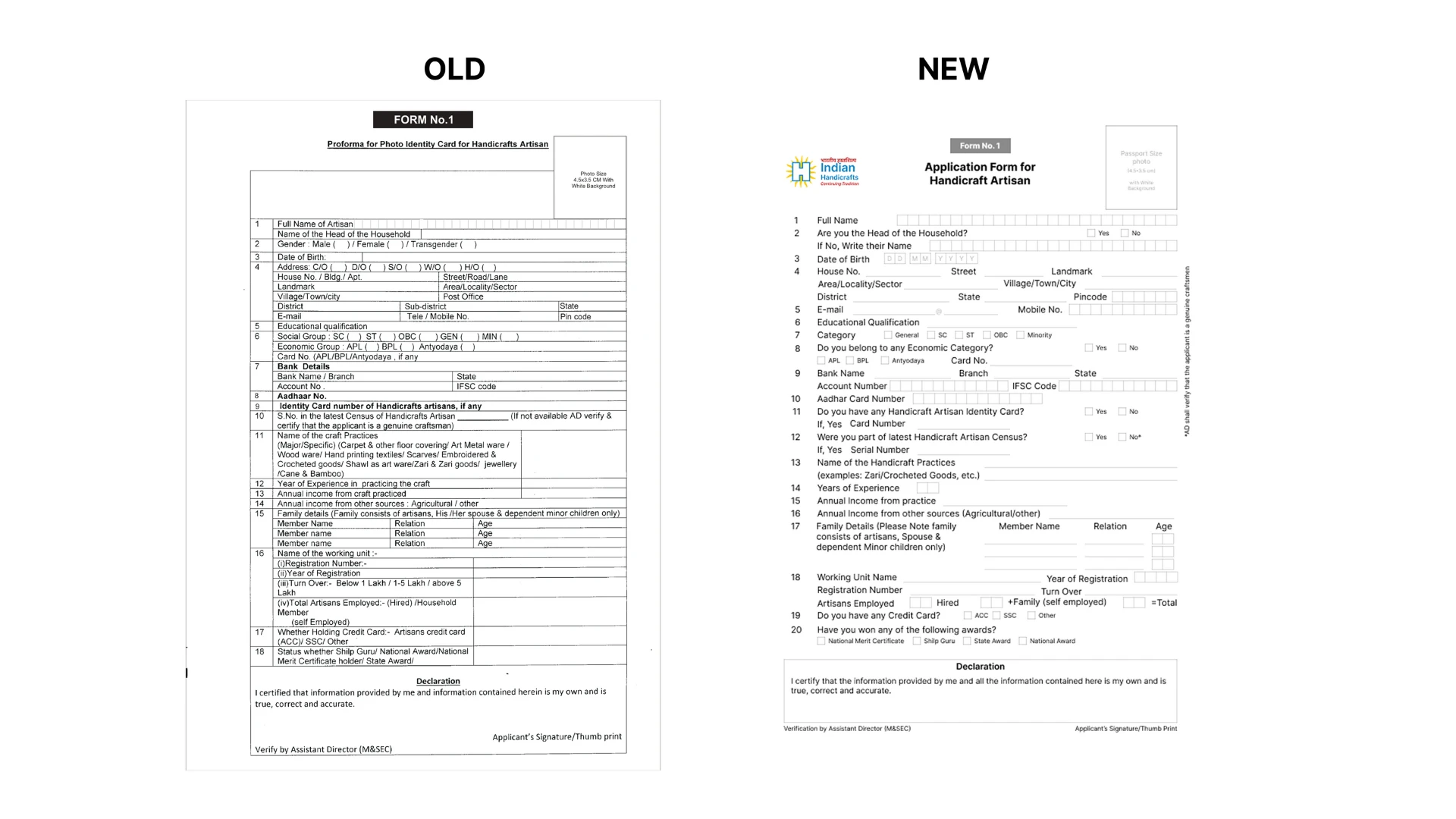
Four changes do most of the work. Each one asks less of the person filling in the form.
The expected format, made clear
The form asks, then follows up
A structure for repeated entries
Visible choices
 RedesignOriginal
Where it stands
Less interpretation, more clarity.
The redesign brings familiar language, visible choices and a consistent writing structure to the same paper format. The focus is clarity at the point of entry: what is being asked, how to answer and what to do next.
This study documents the audit and design decisions. Testing with artisans and facilitators would be needed to assess completion time, errors, and where people still need help.